DEG ReDUX
Re-conceptualizing graphics to tell a persuasive story.
The professionals in DEG's litigation graphics department have a singular goal – creating persuasive graphics. In 2019, after seeing a poorly designed graphic in The Wall Street Journal, team members started discussing how DEG would have done it differently. That conversation led to the creation of the DEG ReDUX series. We have created dozens of ReDUX graphics and are still going strong.
Each ReDUX has three components – the original graphic, our annotations identifying aspects in need of improvement, and our re-conception had we been asked to create it. There are a few tenets to which we hold firmly in creating every ReDUX.
- We use the data as presented in the original graphic. The point isn’t the data, it’s effective visual persuasion.
- To keep the focus on graphics and impactful design, we try to avoid divisive and partisan issues. ReDUX graphics are fervently non-political.
- ReDUX graphics are not about making the original ‘pretty,’ but focused on creating explanatory graphics that tell your most impactful story.
The full ReDUX collection - by authors Dan Bender and Pierre Kressmann - can be followed at https://www.linkedin.com/showcase/deg-redux. These graphics are excellent examples of our work because they show both our abilities and the thought behind the design.
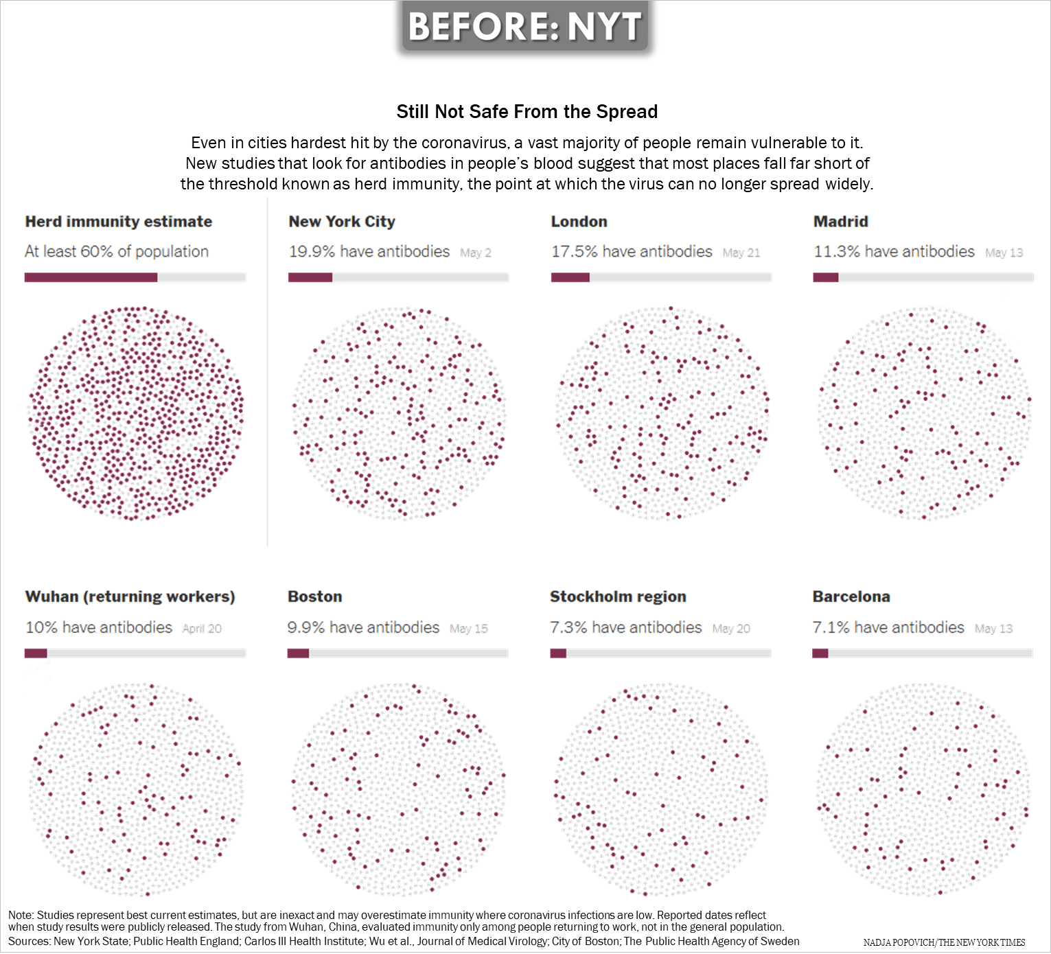
What do you think the following graphic is trying to portray? Is the story clear to you?
Hover over the “?” to view issues we see with the graphic, then scroll down to see the DEG ReDux.
Here’s our re-conception of this graphic.


