Introducing DEG ReDUX
The online series re-conceptualizing graphics to tell a persuasive story.
The professionals in DEG's litigation graphics department have a singular goal – creating persuasive graphics. In 2019, after seeing a poorly designed graphic in The Wall Street Journal, team members started discussing how DEG would have done it differently. That conversation led to the creation of the DEG ReDUX series. We have created dozens of ReDUX graphics and are still going strong.
Each ReDUX has three components – the original graphic, our annotations identifying aspects in need of improvement, and our re-conception had we been asked to create it. There are a few tenets to which we hold firmly in creating every ReDUX.
- We use the data as presented in the original graphic. The point isn’t the data, it’s effective visual persuasion.
- To keep the focus on graphics and impactful design, we try to avoid divisive and partisan issues. ReDUX graphics are fervently non-political.
- ReDUX graphics are not about making the original “pretty.” We never criticize aesthetics unless they detract from the message. In fact, many times we have kept the original look and feel – even if it wouldn’t have been our first choice – in order to show that the way the information was put together is what was lacking. Even so, we do make an effort to make them pleasing to view. A graphic at which the viewer likes looking has a greater chance of making an impact.
The full ReDUX collection - by authors Dan Bender and Pierre Kressmann - can be followed at https://www.linkedin.com/showcase/deg-redux. These graphics are excellent examples of our work because they show both our abilities and the thought behind the design.
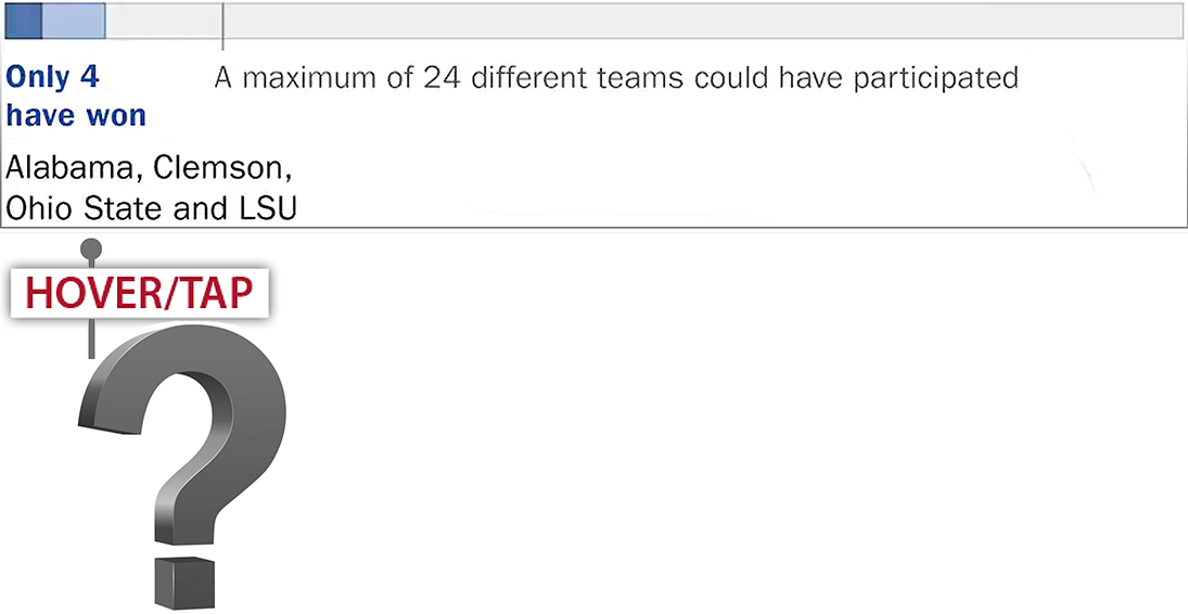
Can you guess the changes we would make to the graphic, below?
Here’s our re-conception of this graphic.


